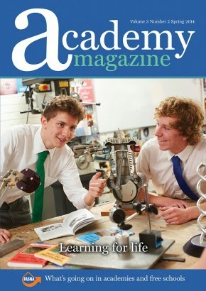
 The masthead
for this magazine is “Academy magazine” this was most likely chosen as the
masthead to possibly emphasis to people that this academy is related to schools
that are academies. This magazine would
appeal to students who possibly go to a school like this or are interested in
the magazines appearance. The first thing that readers will lay their eyes upon
is the picture on the cover of the two boys in a class. This image is effective
as it shows students who are very interested in their studies and by their
facial expression they seem to be enjoying their class. This is relative to the
magazine as it is advertising their school and wants readers who are interested
in the school to read it. The two boys
in the image look to be the same age so this may suggest that the magazine only
talks about a certain age group of students and what they may be doing at
school.
It is hard
to tell when exactly the magazine was published but at the top right hand
corner the magazine reads “spring 2014” this suggest that magazine is seasonal,
this would mean that there are four magazines a year.
The masthead
of the magazine is in huge font and this is easier for the reader to see
magazine as it is eye catching and a bright colour over the background colour. The
colours of the magazine may be a theme of the school and perhaps are the colours
of the schools logo or uniforms. The slogan at the bottom of the page “learning
for life” suggests that this school or college that the magazine is promoting
is interested in how their students are doing in school.
As the
magazines masthead reads “academy magazine” it initially proves to the reader
that it is a school magazine and the picture suggests that the school could
possibly be an all boy’s school as were only aware of the boys in the picture
and it does not tell us if girls attend the school either. This magazine does not have any cover lines so
this will encourage the reader to boy the magazine to find out what is inside. However
at the bottom of the magazine in small font reads “what’s going on in academies
and free schools” so this indicates to the reader that there is information in
the magazine about the school and other schools.
The picture
of the boys in their uniform also can help parents relate to what their child
will look like in this type of uniform and this may help them decide on what
school to enrol their child in.

